The easiest way to choose a chalk paint colour is to start from the room and the piece, not the colour chart. Soft neutrals like Broken White, Cream, Stone and London Grey suit most rooms and most furniture. Stronger shades like Blue Indigo, Oliva Vintage, Mustard and Turquoise work best on one statement piece. Remember that the ultra-matte chalk finish makes every colour look a little softer and chalkier than a glossy swatch. Spray a test patch, let it dry, and judge it in the room’s own light. Pintyplus Chalk Finish comes in 19 shades.
At a glance
| Room or piece | Shades to try |
|---|---|
| Living room | Blue Indigo, Oliva Vintage, Stone, Broken White |
| Bedroom and wardrobes | Cream, Light Lavender, Pink Petal, Mint Green |
| Kitchen and dining | Broken White, Ash Grey, London Grey, Blue Indigo |
| Children’s rooms | Mustard, Turquoise, Coral, Pale Turquoise |
| Statement pieces | Red Velvet, Dark Lavender, Black Plumb, Rose Garden |
What are the Pintyplus chalk colours?
The full range on our Pintyplus Chalk Finish Spray Paint page is Broken White, Cream, Brown Chestnut, Stone, Pink Petal, Rose Garden, Mint Green, Blue Indigo, Pale Turquoise, Turquoise, Ash Grey, Black Plumb, Mustard, Oliva Vintage, Red Velvet, London Grey, Coral, Light Lavender and Dark Lavender. All 19 are the same price and the same velvety ultra-matte finish.
Screens show colours differently, so check the swatch in person at our shop if you can, or ask us on WhatsApp for a photo of the can in daylight.
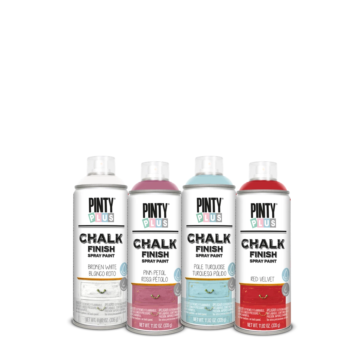
How does a matte chalk finish change a colour?
Matte paint reflects very little light, so colours look softer, dustier and a shade lighter than they do on a glossy swatch. That is a large part of the vintage charm. It also means a colour that seems too strong on the chart can look just right on a chair.
Light matters just as much. Many homes here use cool white LED tube lights in the evening, which make greys and blues look colder and creams look whiter. A room with strong afternoon sun warms everything up. Look at your test patch in daylight and again at night before you commit.
Always judge a colour dry. Wet paint looks darker. Chalk Finish is touch dry in 10 to 20 minutes and dry in 1 hour.
Which shades suit which room?
Living room
Blue Indigo or Oliva Vintage on a sideboard or TV console gives the room a focus. Stone and Broken White suit coffee tables and side tables that sit next to wooden or sheesham furniture, because they don’t compete with the wood.
Bedroom
Cream is the safe, warm choice for a wardrobe or dressing table. Light Lavender, Pink Petal and Mint Green are soft enough for a bedside table or a headboard without making the room feel busy.
Kitchen and dining
Broken White keeps a kitchen bright. Ash Grey and London Grey look clean and modern on cabinets. Blue Indigo on lower cabinets with a light colour above is a popular two-tone look. Seal anything in a kitchen with Chalk Varnish.
Children’s rooms
Mustard, Turquoise, Coral and Pale Turquoise are cheerful on toy boxes, small chairs, shelves and study tables. Seal them too, since children’s furniture gets handled constantly.
Which chalk colours work well together?
- Blue Indigo with Broken White, for two-tone cabinets or a dresser with a white top
- Oliva Vintage with Cream, for a piece painted outside in green and inside in cream
- Brown Chestnut under Broken White, for a distressed look with brown showing on the edges
- London Grey with Black Plumb, for a smart, darker scheme
- Mint Green with Pink Petal, for a nursery or a girl’s room
- Mustard with Ash Grey, for a lively but grown-up study corner
If you layer one colour over another, Pintyplus says to wait 24 hours before spraying a different paint on top. Our guide to chalk spray paint on wood furniture covers the full method.
What can you paint with them?
- A tired MDF wardrobe or almirah, in Cream or Broken White with new handles
- Mismatched dining chairs, all in one colour so they look like a set
- A bedside table or dressing table in a soft shade
- Mirror and picture frames, one colour for a gallery wall
- Kitchen shelves, brackets and spice racks
- Indoor terracotta pots, primed first with Chalk Primer, which lists terracotta among its surfaces
- Gift boxes, trays and decor for Eid, mehndi and wedding functions
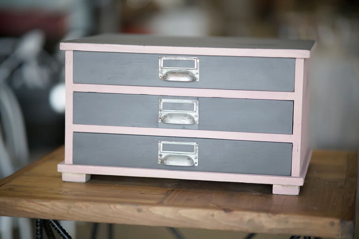
How much paint will a project need?
One can covers about 2 m² per coat, and most pieces need at least two thin coats. A light colour over dark wood usually needs one more. Frames, boxes and small shelves often need less than a can. For wardrobes and cabinets, measure the doors, sides and top, and send us the sizes if you want help working out how many cans to buy.
Common questions
Is there a pure white in the range?
The whites are Broken White, an off-white, and the warmer Cream. Check the swatch before you buy if you need an exact match.
Do dark colours need more care?
Dark matte shades like Black Plumb and Blue Indigo show dust and fingerprints more than light ones, so seal them if they will be handled.
Can I mix two cans to make a new colour?
No. Aerosols can’t be mixed. Layer and distress two colours instead.
Does sealing change the colour?
Chalk Varnish is a clear matte varnish, so the colour stays matte. Test on a hidden spot first.
Where to buy in Lahore and across Pakistan
Pintyplus Chalk Finish Spray Paint is ₨ 3,340 for a 400 ml can, in all 19 colours. You can pick it up from our shop at Sohail Centre, LG 8, Dil Muhammad Road, Garhi Shahu, Lahore, Monday to Saturday from 8:30 AM to 10:00 PM, or order online for delivery anywhere in Pakistan.
Not sure which one you need? Send a photo on WhatsApp to 0321 999 3919 and we’ll tell you.
More on chalk finishes: Furniture & Chalk Finishes