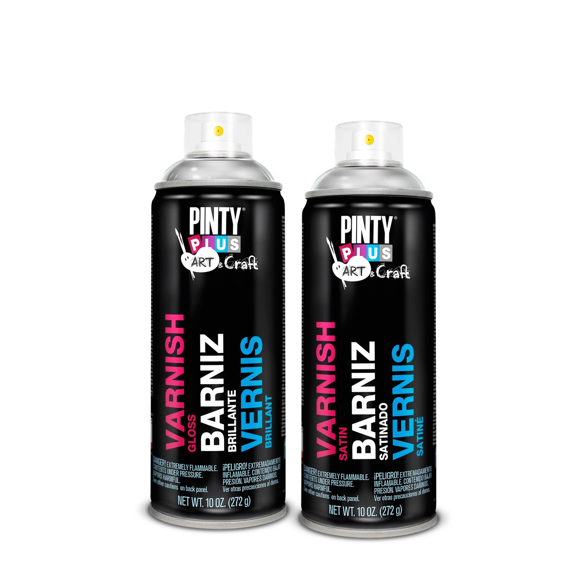
Choose gloss when you want the richest colour and a shiny, protective look, matte when you want no reflection at all, and satin when you want something in between. For most wooden pieces and crafts, satin is the safe choice. For paintings and drawings that will hang under lights or be photographed, matte or satin avoid glare. For bright, bold crafts and anything you want to look polished, gloss works best. Pintyplus Acrylic Varnish Spray and Water-Based Varnish Spray both come in gloss, satin and matte, so you can choose the sheen first and the varnish type second.
At a glance
| Finish | Best for |
|---|---|
| Gloss | Bright crafts, resin and plaster figures, deep colours, a polished look |
| Satin | Wooden boxes, frames and furniture pieces, and when you are unsure |
| Matte | Paintings under lights, vintage-style work, pieces that will be photographed |
| Oil paintings | Pintyplus Varnish Spray for Oil Paintings, which is gloss only |
What does each finish look like?
Gloss
Gloss reflects the most light. Colours look deeper and more saturated, and dark colours look almost wet. It also shows every bump and brush mark in the paint underneath, and reflects lights and windows.
Satin
Satin has a soft, low sheen. It brings up colour a little without looking shiny, and it hides small surface flaws better than gloss.
Matte
Matte reflects almost no light, so there is no glare from any angle. The trade-off is that very dark colours can look slightly lighter and softer under a matte coat.
Whichever finish you choose, spray two thin coats rather than one heavy one. Pintyplus recommends two thin layers for uniform coverage, and an even coat gives an even sheen. A single heavy coat can dry with shinier and duller patches, and it can run.
Which finish for wood?
Satin suits most wooden boxes, trays, frames and small furniture pieces. It looks natural and doesn’t show every fingerprint. Choose gloss for a polished, lacquered look on decorative pieces, and matte for a raw, natural-wood feel. Whichever you choose, the finish is only as smooth as the wood under it, so sand before you varnish and remove all the dust.
Which finish for paintings and canvas?
For acrylic paintings, satin and matte are the popular choices because gallery lights, ring lights and phone flashes bounce off gloss. Gloss is right when you want the colours to look as deep as possible. Pintyplus doesn’t list canvas by name for its craft varnishes, so test on a painted scrap or the edge of the canvas first.
Oil paintings are different. Pintyplus Varnish Spray for Oil Paintings is made for them, and it comes in gloss only.
Which finish for crafts?
- Gloss for plaster and resin figures, painted pottery decor and bright children’s crafts
- Satin for wooden crafts, cork boards and wicker
- Matte for cardboard models, papier mâché and vintage-style decor
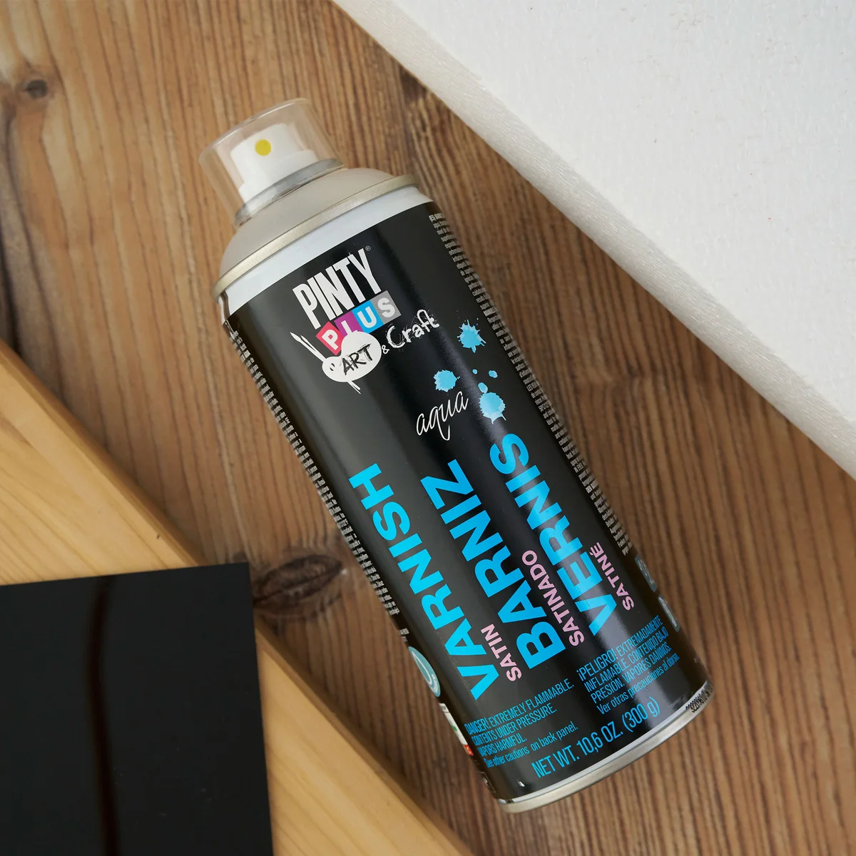
For papier mâché and expanded polystyrene, Pintyplus lists the Water-Based Varnish Spray, which also comes in all three finishes. The two types differ in more than the list of surfaces. Acrylic Varnish is solvent-based and covers about 2 m² per can. Water-Based Varnish is low odour, made for indoor work, and covers about 1.4 m² per can.
Does lighting in the room matter?
Yes. A glossy piece near a sunny window or under bright white tube lights will reflect them, which can make a painting hard to see from some angles. Matte and satin are easier to live with in bright rooms. If you sell your work online or post it on social media, matte and satin also photograph with fewer hot spots from the phone’s flash or a ring light.
How do you test a finish before committing?
Paint a scrap of the same material in the same colours, let it dry, then spray it with the varnish you are considering. Look at it in daylight and under the room’s own lights. It takes a few minutes and saves you varnishing a finished piece in the wrong sheen. Our guide to what acrylic varnish spray does covers drying times and application.
Common questions
Can I change the sheen later?
Yes. Once the first varnish is fully dry, a coat of a different finish on top changes the sheen. Test on a scrap first.
Is gloss more protective than matte?
Pintyplus doesn’t rate its finishes differently for protection. Choose by look.
Which is best for photographing artwork?
Matte or satin, because they reflect less light.
Is there a price difference between finishes?
No. Each varnish is one price for gloss, satin or matte.
Where to buy in Lahore and across Pakistan
Pintyplus Acrylic Varnish Spray is ₨ 3,090 for a 400 ml can, in gloss, satin or matte. You can pick it up from our shop at Sohail Centre, LG 8, Dil Muhammad Road, Garhi Shahu, Lahore, Monday to Saturday from 8:30 AM to 10:00 PM, or order online for delivery anywhere in Pakistan.
Not sure which one you need? Send a photo on WhatsApp to 0321 999 3919 and we’ll tell you.
More on varnishes: Varnishes & Protective Finishes